

Getting Started with React: Creating Your Own Blog App - Part 3
Unlocking the Power of React: Building, Adding, and Displaying Blogs in Your App - Part 3

Sharing what I learn about Cloud, System design, and Code • On my journey to becoming a certified AWS Dev • Writing ebook on System Design
Introduction
In this article of our React blog series, we will learn how to add and display a list of blogs. We will cover basic form handling and validation, the useState React Hook, Props in React, passing values between components, and rendering a list of blogs. This blog post will enhance your understanding of React and make learning it a more straightforward process.
A quick note before we begin: we are building a blog app, and this blog series focuses on learning React through hands-on projects. This will be a basic app without any high-level concepts in React, but in the future, I will introduce some advanced concepts to enhance your understanding.
If you are new to React, I suggest you read my last two blog posts where I explain and demonstrate how to install React with Vite, along with other project setup steps. I highly encourage you to read those blog posts before continuing with this one.
Prerequisites
Familiar with HTML & CSS
Proficiency in Vanilla JavaScript
Any Code Editor
Nodejs Installed on the system
Read my previous blog posts to understand where we are in this series.
What will we learn in this blog post?
Before we deep dive into the code, let me share what we will be learning in this blog post. We are going to explore the React useState Hook and I will explain why useState is the most important aspect of React. Additionally, we will install some essential packages such as react-draft-wysiwyg, draftjs, and prop-types.
We will also learn about props in React and how to pass data between components. When implementing the "add blog" feature, we will explore form validation. We will dive deeper into form validation and handling once we implement the profile section in our blog.
To simplify the process, we will not use any form validation packages for the "Add blog" feature. Additionally, I will create some reusable components to demonstrate how to break down the UI and make each element or section a reusable component.
Now, let's install the packages required for our blog app.
Installing Necessary Packages
Before we start writing our code, we need some packages that will help us create and format our blog content. Many blogging platforms use a What You See Is What You Get (WYSIWYG) editor. This type of editor allows users to format text and add elements, such as images, links, and lists, using familiar tools similar to word processors. The formatting applied in the editor is visually represented, allowing users to see how their content will appear when published.
We require a rich text editor for our blog application. To achieve this, we will utilize react-draft-wysiwyg and draft-js.
Open up your VSCode terminal and navigate to your project directory, and use npm to install the react-draft-wysiwyg, draft-js, draftjs-to-html, prop-types package:
npm install react-draft-wysiwyg draft-js draftjs-to-html prop-types
Now, let me explain the purpose of these packages, their functions, and the reasons for using them in our project.
draft-js:draft-jsis a low-level library developed by Facebook for building rich text editors in React. It provides a framework for managing the state of the editor content, handling user input, and rendering the content with various formatting options.Why use
draft-js: We are creating a Blog App that requires extensive customization of the rich text editing experience,draft-jsgives you fine-grained control over the editor's behavior and appearance. It's a powerful choice for building complex editors tailored to your specific requirements.react-draft-wysiwyg: This package provides a set of React components to build a rich text editor with a "What You See Is What You Get" (WYSIWYG) interface. It's built on top ofdraft-jsand abstracts many of the complexities of working withdraft-js, making it easier to create and manage rich text content in your application. It offers features like text formatting (bold, italics, etc.), lists, links, images, and more.Why use
react-draft-wysiwyg: We need to allow users to compose and format rich text content in our application, using a package likereact-draft-wysiwygwe can save a significant amount of development time compared to building a custom editor from scratch.draftjs-to-html: This package is used to convert the content generated bydraft-jsinto HTML markup. It's especially useful when we need to display the rich text content created in our editor on a webpage.Why use
draftjs-to-html: When we want to render the content generated bydraft-jseditor as HTML,draftjs-to-htmlprovides a convenient way to perform the conversion.prop-types:prop-typesis a package that helps us to document and validate the props that our React components expect. It ensures that the props we pass to a component match the expected types and provides helpful warnings during development if there's a mismatch.Why use
prop-types: Usingprop-typesis a good practice for maintaining code quality and catching potential bugs early. It provides clear documentation for the expected props of your components and helps you avoid runtime errors due to incorrect prop usage.
You might be wondering what props are and why we use them in our React app components.
What are props in React and why do we use them in our app components?
In React, "props" is short for "properties." Props are an excellent method for sharing data between parent and child components. They allow us to pass values or even functions to child components, which can then be used for performing specific actions or rendering data.
Props are read-only and cannot be modified by the child component that receives them. They provide a way to make your components reusable and modular, as you can customize their behaviour or appearance by passing different data to them.
Allow me to clarify with a straightforward example.
import React from 'react';
import ChildComponent from './ChildComponent';

function ParentComponent() {
  const message = 'This is cool Child!!';

  return (
    <div>
      <ChildComponent onPassMessagetoChild={message} />
    </div>
  );
}

export default ParentComponent;
import React from 'react';

function ChildComponent(props) {
  return (
    <div>
      <p>Hey, {props.onPassMessagetoChild}!</p>
    </div>
  );
}

export default ChildComponent;
In this example, the ParentComponent passes the onPassMessagetoChild prop to the ChildComponent. The ChildComponent receives the prop through its props parameter and uses it to display a message.
Additionally, remember that props can be used to pass not only data but also functions. This enables communication between components and allows the implementation of actions triggered by user interactions.
There is another concept, called props destructuring, that we learn when creating a reusable component.
I hope you now understand what props are. If you don't fully grasp the concept, don't worry; we will be using props multiple times in our blog app. Just remember that props are an excellent way to share data between parent and child components.
What is useState in React?
Let's understand what is meant by state, State is a way to manage and store data that can change over time, like user input, API responses, or any dynamic data in your application And useState is a hook that allows you to add state to functional components.
Here are the steps on how to implement useState in React
Import
useState: Import theuseStatefunction from thereactlibrary at the top of your component file.Use
useState: Call theuseStatefunction and pass an initial value as its argument. This returns an array with two elements: the current state value and a function to update the state.Access State: You can access the current state value just like any other variable.
Update State: To update the state, call the function returned by
useState, passing the new value. React will re-render the component and update the state.
This might confuse you let me help you understand with a simple example:
import React, { useState } from 'react';

function CounterApp() {
  // Using useState to manage the count state
  const [count, setCount] = useState(0);

  return (
    <div>
      <p>Count: {count}</p>
      <button onClick={() => setCount(count + 1)}>Increment</button>
    </div>
  );
}

export default CounterApp;
In this example, useState(0) initializes the state variable count to 0. When the "Increment" button is clicked, the setCount function is called with the new value of count + 1, causing the component to re-render with the updated state.
I hope you understand what useState is. If you don't understand it fully, don't worry; we'll be using useState extensively in our blog app.
Now, let's write some actual React code for our blog app.
Creating Reusable UI Components
As we know reactJs is famous for its component base architecture which means it can break UI into smaller and reusable components. So lets break down our add blog app into smaller components.
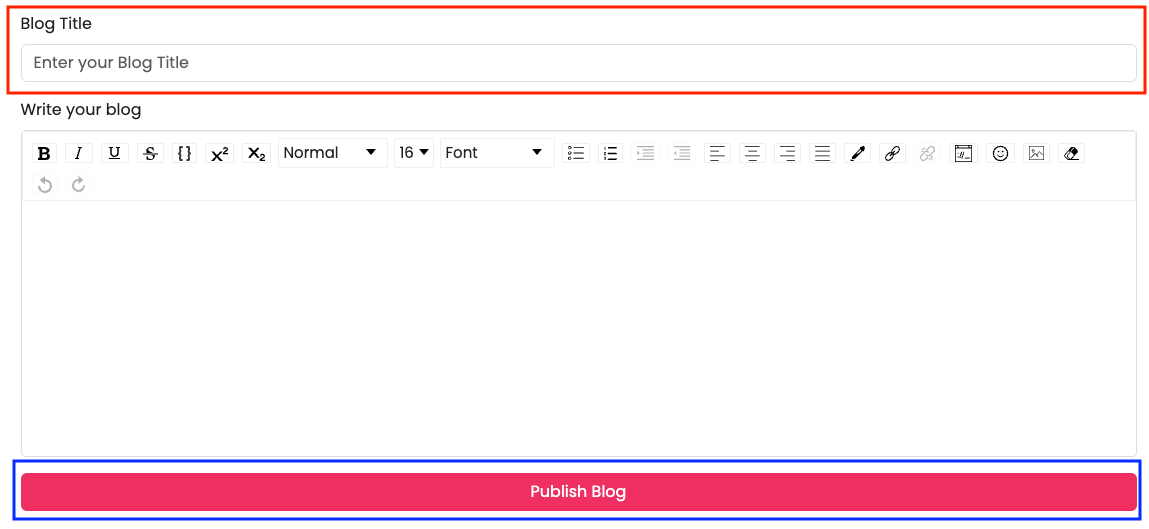
This is our simple blog form. As you can see, we have an input field for adding the blog title, a text editor for writing and managing blog content, and a button.
Now, let's consider how to break down our UI components. First, examine the design to identify common elements in our app and use those elements/designs as reusable components. Upon inspecting our blog app design, we can see that we need an input field on the add blog page, edit blog page, and profile page. Additionally, we need to use buttons throughout our app, so let's break these two elements into reusable components.
Creating a Custom InputText Field
Let's create a reusable input field component.
CustomInputText.jsx
import { Form } from "react-bootstrap";
import PropTypes from "prop-types";

function CustomInputText({
  inputLabel,
  inputType,
  inputPlaceholder,
  inputValidationMsg,
  inputOnChange,
  inputValue,
  inputIsValid,
}) {
  return (
    <Form.Group className="mb-3" controlId="exampleForm.ControlInput1">
      <Form.Label>{inputLabel}</Form.Label>
      <Form.Control
        type={inputType}
        placeholder={inputPlaceholder}
        onChange={inputOnChange}
        value={inputValue}
        isInvalid={inputIsValid}
      />
      <Form.Control.Feedback className="" type="invalid">
        {inputValidationMsg}
      </Form.Control.Feedback>
    </Form.Group>
  );
}

CustomInputText.propTypes = {
  inputLabel: PropTypes.string.isRequired,
  inputType: PropTypes.oneOf(["text", "number", "email", "password"]),
  inputPlaceholder: PropTypes.string.isRequired,
  inputValidationMsg: PropTypes.string.isRequired,
  inputOnChange: PropTypes.func.isRequired,
  inputValue: PropTypes.string,
  inputIsValid: PropTypes.bool.isRequired,
};

export default CustomInputText;
Let me explain this code
Formfrom"react-bootstrap": This imports theFormcomponent from thereact-bootstraplibrary.PropTypesfrom"prop-types": This imports thePropTypesobject from theprop-typeslibrary.It takes in several props as its parameters:
inputLabel,inputType,inputPlaceholder,inputValidationMsg,inputOnChange,inputValue, andinputIsValid.Form.Label: Displays the label text for the input field. The label text is taken from theinputLabelprop.Form.Control: This is an input control fromreact-bootstrap. It has several attributes like:-type: The type of input, taken from theinputTypeprop.placeholder: The placeholder text for the input field, taken from theinputPlaceholderprop.onChange: The function to be called when the input value changes, taken from theinputOnChangeprop.value: The current value of the input field, taken from theinputValueprop.isInvalid: A boolean that indicates whether the input is invalid, taken from theinputIsValidprop.Form.Control.Feedback: This displays the validation feedback message when the input is invalid. The message is taken from theinputValidationMsgprop.After the component definition, the
propTypesobject is defined.propTypesdefine the expected types and requirements for each prop that the component receives. For example,inputLabelis expected to be a required string,inputTypeis expected to be one of the specified types, and so on.The
CustomInputTextcomponent is exported as the default export of the module.
This code defines a reusable CustomInputText component that can be used to render a form input field with a label, placeholder, validation message, and other attributes. It also includes PropTypes validation to ensure that the component receives the expected props with the correct types.
You might be wondering why we aren't using props here. Instead, we are utilizing prop destructuring.
Let me help you understand by providing an example.
Prop destructuring is a technique in React that simplifies working with props by extracting their values directly into the function parameter list. This approach is particularly beneficial when managing multiple props.
Prop destructuring enhances code readability and minimizes redundancy, resulting in more concise and easily maintainable component code.
Here's a simple breakdown of prop restructuring:
Before using Prop destructuring:
function Person(props) {
  return (
    <div>
      <p>Name: {props.name}</p>
      <p>Age: {props.age}</p>
    </div>
  );
}
After using Prop destructuring:
function Person({ name, age }) {
  return (
    <div>
      <p>Name: {name}</p>
      <p>Age: {age}</p>
    </div>
  );
}
instead of using props.name and props.age, we're directly destructuring the name and age props from the props object. This makes the code shorter, cleaner, and easier to understand.
Now you understand what prop destructuring is and why we use it.
Creating a Custom Button
Lets create a reusable button component
CustomButton.jsx
import { Button } from "react-bootstrap";
import PropTypes from "prop-types";

function CustomButton({
  buttonType,
  buttonText,
  buttonClassName,
  buttonOnClick,
  isDisabled,
}) {
  return (
    <Button
      className={buttonClassName}
      type={buttonType}
      onClick={buttonOnClick}
      disabled={isDisabled}
    >
      {buttonText}
    </Button>
  );
}

CustomButton.propTypes = {
  buttonType: PropTypes.oneOf(["button", "submit", "reset"]),
  buttonText: PropTypes.string.isRequired,
  buttonClassName: PropTypes.string,
  buttonOnClick: PropTypes.func.isRequired,
  isDisabled: PropTypes.bool,
};

CustomButton.defaultProps = {
  buttonType: "button",
  buttonClassName: "",
};

export default CustomButton;
Let me explain this code
Buttonfrom"react-bootstrap": This imports theButtoncomponent from thereact-bootstraplibrary.PropTypesfrom"prop-types": This imports thePropTypesobject from theprop-typeslibrary.CustomButtoncomponent takes in several props as its parameters:buttonType,buttonText,buttonClassName,buttonOnClick, andisDisabledclassName: The class name for the button, taken from thebuttonClassNameprop.type: The type of the button (e.g., submit, reset), taken from thebuttonTypeprop.onClick: The function to be called when the button is clicked, taken from thebuttonOnClickprop.disabled: A boolean indicating whether the button is disabled, taken from theisDisabledprop.The content of the button is set using the
buttonTextprop. This is the text that will be displayed on the button.propTypesdefine the expected types and requirements for each prop that the component receives.For example,
buttonTypeis expected to be one of the specified types,buttonTextis expected to be a required string, and so on.The
defaultPropsobject is defined to provide default values for props that are not specified.For example,
buttonTypeis set to"button"by default, andbuttonClassNameis an empty string by default.The
CustomButtoncomponent is exported as the default export of the module.
this code defines a reusable CustomButton component that creates a styled button using the Button component from react-bootstrap. It allows you to customize the button's type, text, class name, and behavior using props.
The PropTypes validation ensures that the component receives the expected props with the correct types. Default props provide fallback values if certain props are not provided.
Now you understand how to create a reusable UI component. Your task is to create each reusable component that will be used in this app.
Creating an "Add Blog" Form
We have created some reusable UI components, and you now know how to create them. Let's put this knowledge into action and create our Add Blog form.
blog.jsx
// Import necessary components and libraries
import { Row, Container, Form } from "react-bootstrap";
import { useState } from "react";
import { convertToRaw, EditorState } from "draft-js";
import { Editor } from "react-draft-wysiwyg";
import draftToHtml from "draftjs-to-html";
import PropTypes from "prop-types";

// Import local utility and component files
import CustomInputText from "../components/customInputText";
import CustomButton from "../components/customButton";
import CustomAlert from "../components/customAlert";
import formatDateTime from "../utils/format_date";
import isEditorEmpty from "../utils/editor_empty";
import "../css/button.css";
import "../css/blog.css";

// Create a functional component named "Blog"
function Blog({ onPassDatatoAppComponent }) {
  // UseState Hooks to manage various states
  const [blogTitle, setBlogTitle] = useState("");
  const [blogContent, setBlogContent] = useState(EditorState.createEmpty());
  const [formSubmitted, setFormSubmitted] = useState(false);
  const [alert, setAlert] = useState(false);
  const currentDate = new Date();

  // Function triggered when the "Publish Blog" button is clicked
  const onSubmitBtnClick = (e) => {
    e.preventDefault(); // Prevent the default form submission behavior

    // Handling form submission
    if (blogTitle && !isEditorEmpty(blogContent)) {
      // If both title and content are provided
      // Call the prop function to pass data
      onPassDatatoAppComponent({
        title: blogTitle,
        content: draftToHtml(convertToRaw(blogContent.getCurrentContent())),
        date: formatDateTime(currentDate),
      });
      // Reset form submission status
      setFormSubmitted(false);
      // Show success alert
      setAlert(true);
      // Clear title and content fields
      setBlogTitle("");
      setBlogContent(EditorState.createEmpty());
      // Hide the alert after a delay
      setTimeout(() => {
        setAlert(false);
      }, 3000);
    } else {
      // If title or content is missing
      // Set form submission status and show a warning alert
      setFormSubmitted(true);
      setAlert(true);
      // Hide the alert after a delay
      setTimeout(() => {
        setAlert(false);
      }, 3000);
    }
  };

  // Return JSX for rendering
  return (
    <Container>
      <Row style={{ paddingTop: 90 }}>
        <Form className="mt-3">
          {/* Render the custom input text component */}
          <CustomInputText
            inputLabel={"Blog Title"}
            inputPlaceholder={"Enter your Blog Title"}
            inputType={"text"}
            inputValidationMsg={"Please add Blog Title"}
            inputValue={blogTitle}
            inputOnChange={(e) => setBlogTitle(e.target.value)}
            inputIsValid={formSubmitted && blogTitle === ""}
          />

          {/* Render the editor component */}
          <Form.Group className="mb-3" controlId="exampleForm.ControlTextarea1">
            <Form.Label>Write your blog</Form.Label>
            <Editor
              defaultEditorState={blogContent}
              onEditorStateChange={setBlogContent}
            />
            <Form.Control.Feedback
              style={{
                display:
                  formSubmitted && isEditorEmpty(blogContent)
                    ? "block"
                    : "none",
              }}
              type="invalid"
            >
              Please add blog content.
            </Form.Control.Feedback>
          </Form.Group>

          {/* Render the alert component based on conditions */}
          {isEditorEmpty(blogContent) && blogTitle === "" && formSubmitted ? (
            <CustomAlert
              isVisible={alert}
              alertMessage="Please fill all required forms ❌"
              alertClass="danger"
            />
          ) : (
            <CustomAlert
              isVisible={alert}
              alertMessage="Your blog publish successfully 🎉"
              alertClass="success"
            />
          )}

          {/* Render the custom button component */}
          <CustomButton
            buttonText={"Publish Blog"}
            buttonType={"submit"}
            buttonClassName={"btn btn-custom w-100"}
            buttonOnClick={(e) => onSubmitBtnClick(e)}
          />
        </Form>
      </Row>
    </Container>
  );
}

// Prop type validation for the "onPassDatatoAppComponent" prop
Blog.propTypes = {
  onPassDatatoAppComponent: PropTypes.any,
};

// Export the "Blog" component as the default export
export default Blog;
Let's break it down this code step by step:
Various components and utilities are imported from different libraries and local files.
Functional Component -
Blog:This is a functional component named
Blog.It accepts a prop called
onPassDatatoAppComponent.
UseState Hooks:
- Multiple
useStatehooks are used to manage component state. These hooks store values for blog title, blog content, form submission status, alert status, and current date.
- Multiple
onSubmitBtnClickFunction:This function is called when the "Publish Blog" button is clicked.
It prevents the default form submission behaviour.
It handles form submission:
If both blog title and content are filled, it:
Calls the
onPassDatatoAppComponentprop function with data.Resets form submission status, shows a success alert, clears title and content, and hides the alert after a 3-second delay.
If either the blog title or content is missing, it:
- Sets form submission status, shows a warning alert and hides the alert after a 3-second delay.
Component JSX:
The component returns JSX, which defines the structure and content of the blog form.
It uses the
CustomInputText,Editor, andCustomButtoncomponents.
CustomInputTextComponent:It's a custom component that provides an input field for the blog title.
It takes various props for customization.
EditorComponent:It's a rich text editor from the
react-draft-wysiwyglibrary for composing blog content.It uses the
EditorStatefromdraft-jsto manage the editor's state.
Alerts:
- Depending on form submission status and content, different alerts are displayed using the
CustomAlertcomponent.
- Depending on form submission status and content, different alerts are displayed using the
CustomButtonComponent:It's a custom button component for submitting the blog.
It triggers the
onSubmitBtnClickfunction on click.
PropTypes Validation:
- The
propTypesobject is defined to specify the expected types for theonPassDatatoAppComponentprop.
- The
Export:
- The
Blogcomponent is exported as the default export of the module.
- The
This code creates a blog creation form using various libraries, custom components, and custom utility functions. It handles state management, form submission, and validation. The form includes input fields for the blog title and content, and a rich text editor is used to compose the blog content.
By using custom components for different parts of the form, enhancing code readability and maintainability.
The code draftToHtml(convertToRaw(blogContent.getCurrentContent())) is used to convert the content from the EditorState (blogContent) of the rich text editor into HTML format. This HTML content can then be used, for example, to display the blog content in a formatted way on a webpage or to save it as HTML data in a database. It's a common approach when you want to handle rich text content created with draft-js in a web application.
Note: The editor dropdown will not function properly due to React Strict Mode. To resolve this issue, remove React Strict Mode from the main.jsx file.
Creating a "Blog List" Page
homepage.jsx
import { Stack, Container, Row, Col, Form } from "react-bootstrap";
import PropTypes from "prop-types";
// Local Imports
import BlogItem from "../components/blogItem";
import "../css/homepage.css";
function Homepage({ blogListData }) {
return (
<div className="main-content">
<Container>
<section id="search-section">
<Row>
<Col>
<div className="searchfield">
<Form.Control type="text" placeholder="Search Blog" />
<i className="fa fa-search" aria-hidden="true"></i>
</div>
</Col>
</Row>
</section>
<section id="bloglist-title-section">
<div className="bloglist-title">
<h2>All Blogs</h2>
<i className="fa fa-file-text-o" aria-hidden="true"></i>
</div>
</section>
<section id="bloglist-section">
<Stack gap={3}>
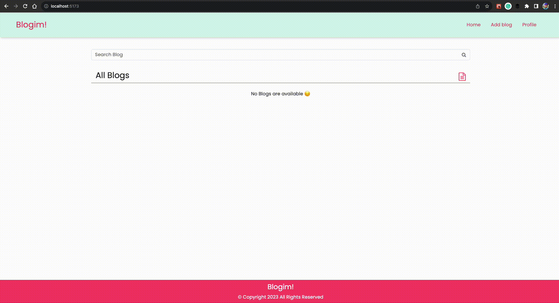
{blogListData.length === 0 ? (
<p style={{ textAlign: "center" }}>No Blogs are available 😔</p>
) : (
blogListData.map((blog, i) => (
<BlogItem
key={i}
blogTitle={blog.title}
blogAuthor={"Pradhuman Padhiyar"}
blogTimeAndDate={blog.date}
blogAuthorImage={
"https://api.dicebear.com/6.x/open-peeps/svg?face=angryWithFang,calm,blank"
}
/>
))
)}
</Stack>
</section>
</Container>
</div>
);
}
Homepage.propTypes = {
blogListData: PropTypes.any,
};
export default Homepage;
The necessary components and libraries are imported, including
Stack,Container,Row,Col,Formfromreact-bootstrapandPropTypesfor prop type validation.The local component
BlogItemand a stylesheethomepage.cssare also imported.Functional Component -
Homepage:This is a functional component named
Homepage.It accepts a single prop called
blogListData.
Component JSX:
- The component returns JSX, which defines the structure and content of the homepage.
Search Section:
- This section contains a search field using
Form.Controlfromreact-bootstrap. An icon from the FontAwesome library (fa fa-search) is also included.
- This section contains a search field using
Blog List Title Section:
- This section displays the title "All Blogs" along with an icon (
fa fa-file-text-o).
- This section displays the title "All Blogs" along with an icon (
Blog List Section:
This section uses the
Stackcomponent fromreact-bootstrapto create a gap between blog items.The content inside the
Stackcomponent is conditionally rendered based on the length ofblogListData.If
blogListDatais empty, a message "No Blogs are available 😔" is displayed.If
blogListDatahas items, theblogListDataarray is mapped over, and for each blog item, theBlogItemcomponent is rendered with specific props.
BlogItemComponent:This component is rendered for each blog item.
It receives props like
blogTitle,blogAuthor,blogTimeAndDate, andblogAuthorImage.
Prop Type Validation:
- The
propTypesobject is defined to specify the expected type for theblogListDataprop.
- The
Export:
- The
Homepagecomponent is exported as the default export of the module.
- The
app.jsx
import React, { useState } from "react";
import { Routes, Route } from "react-router-dom";

//Local Imports
import Header from "./components/header";
import Footer from "./components/footer";
import Homepage from "./pages/homepage";
import Blog from "./pages/blog";
import Profile from "./pages/profile";
import NoPageFound from "./pages/no_page_found";
import "./App.css";

function App() {
  const [blogListData, setBlogListData] = useState([]);

  const onGetDataFromBlogComponent = (blogData) => {
    setBlogListData((prevDataArray) => [blogData, ...prevDataArray]);
    console.log(blogData);
  };

  return (
    <React.Fragment>
      <Header />
      <Routes>
        <Route path="/" element={<Homepage blogListData={blogListData} />} />
        <Route
          path="/blog"
          element={
            <Blog onPassDatatoAppComponent={onGetDataFromBlogComponent} />
          }
        />
        <Route path="/profile" element={<Profile />} />
        <Route path="*" element={<NoPageFound />} />
      </Routes>
      <Footer />
    </React.Fragment>
  );
}

export default App;
In our previous blog, I explain about react-router-dom so im not going to deep dive ino this, im goign to explain rest other code which is replated to showing blog list.
UseState Hook -
blogListData:The
blogListDatastate is created using theuseStatehook to manage the list of blog data.The initial state is an empty array.
onGetDataFromBlogComponentFunction:This function receives data from the
Blogcomponent via a prop.It updates the
blogListDatastate by adding the newblogDatato the beginning of the array using the spread operator.It logs the received
blogDatato the console.
Homepage Route:
The
Homepagecomponent is rendered when the path is/.The
blogListDatastate is passed as a prop to theHomepagecomponent.
Blog Route:
The
Blogcomponent is rendered when the path is/blog.The
onPassDatatoAppComponentfunction is passed as a prop to theBlogcomponent. This function will be used to update theblogListDatastate when new blog data is submitted.
You can get all this code from github repository
Run your APP
Simply run the following command in your terminal:
npm run dev
Now give yourself a pat on the back, as you've just implemented useState, Props, reusable components, and added as well as listed blogs in our React app.
So, that concludes this blog post.
What's Next?
In the next blog, we will implement a feature that allows us to edit and update the blog, as well as delete it. We will learn more about dynamic routes and how to navigate to different pages programmatically.
Conclusion
In conclusion, this article helps you build a React blog application, covering key concepts like useState, props, reusable UI components, and routing. Following this guide will enhance your understanding of React and its best practices, enabling you to create more efficient and maintainable applications in the future.
Stay tuned for the next blog, where we will cover editing, updating, and deleting blog posts, as well as dynamic routes and programmatic navigation.
Also, Follow me on Twitter or Linkedin I share about Cloud, System Design, Code, and many more tech stuff 😊


